
Cryptominer: designing a retention loop
Designing and simplifying a popular feature to improve repeat use and retention.
ROLE
Product Designer
TIMELINE
2020 – 2021
COLLABORATION
CEO, product manager, risk, marketing, engineering, QA
PRODUCT CONTEXT
An all-in-one crypto platform
StormGain combined a multi-currency wallet, margin trading with high leverage, and a crypto exchange on the web and mobile. I led UX for mining and also worked on crypto and stock trading.
The problem
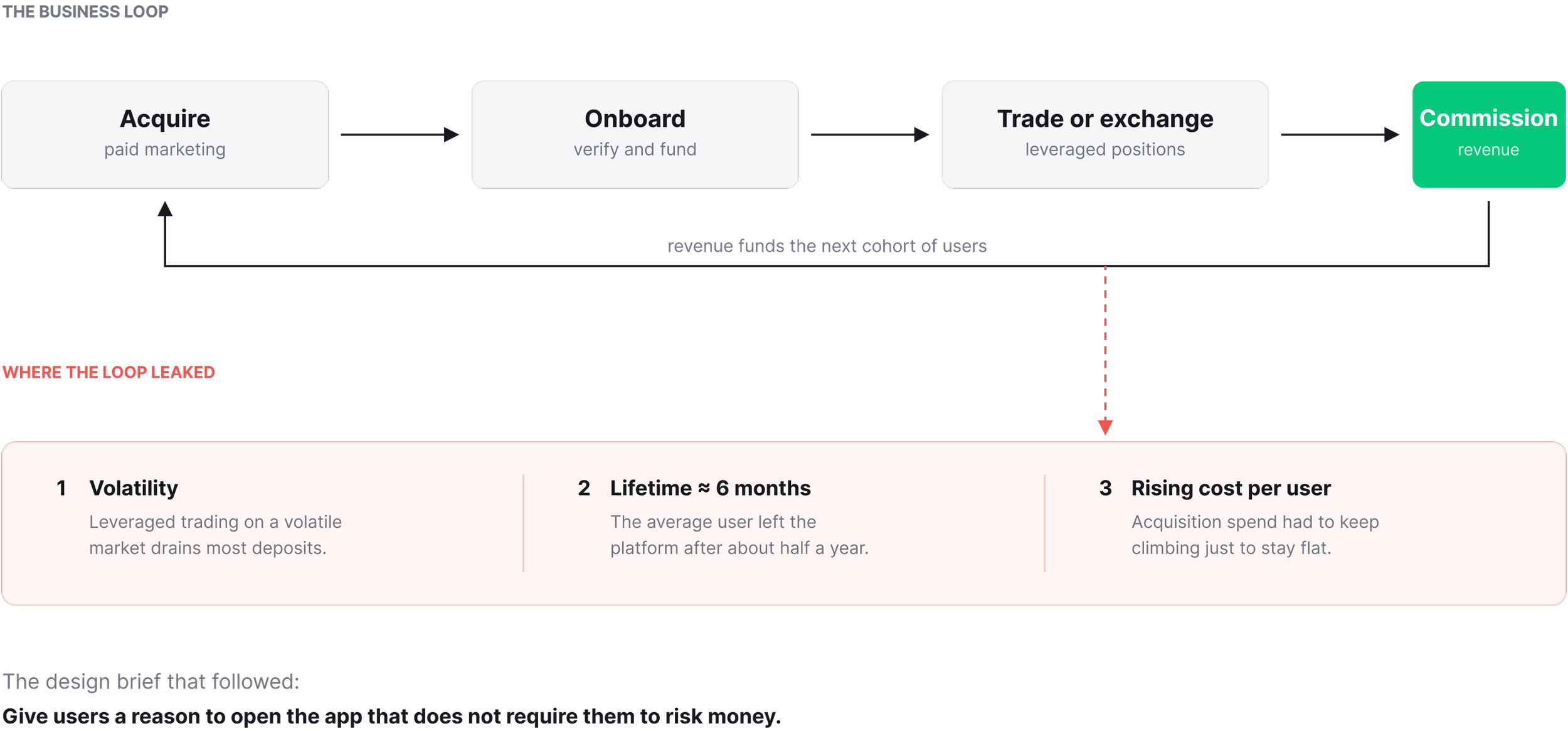
The business ran on commission from every trade. But leveraged trading on a volatile market drains most deposits, and the average user lifetime was about six months.
Short lifetimes made users expensive to acquire. Retention became a company priority.
DISCOVERY
Users wanted free coins
Why classic mining did not work for users
Hardware. Competitive mining needs equipment nobody wants to buy.
Performance. Mining on a normal computer slows it down.
Electricity. Running costs eat the reward.
Real demand, poor options. That was the opening.
In ongoing interviews, one thing came up unprompted: people liked the idea of getting coins for free. Asked which other crypto apps they used, they named mining apps.
FRAMING
What the miner had to be
A miner that runs on our servers, not the user’s phone. We mine, we credit the coins, the user taps a button. Free, no hardware, no drain on the device.
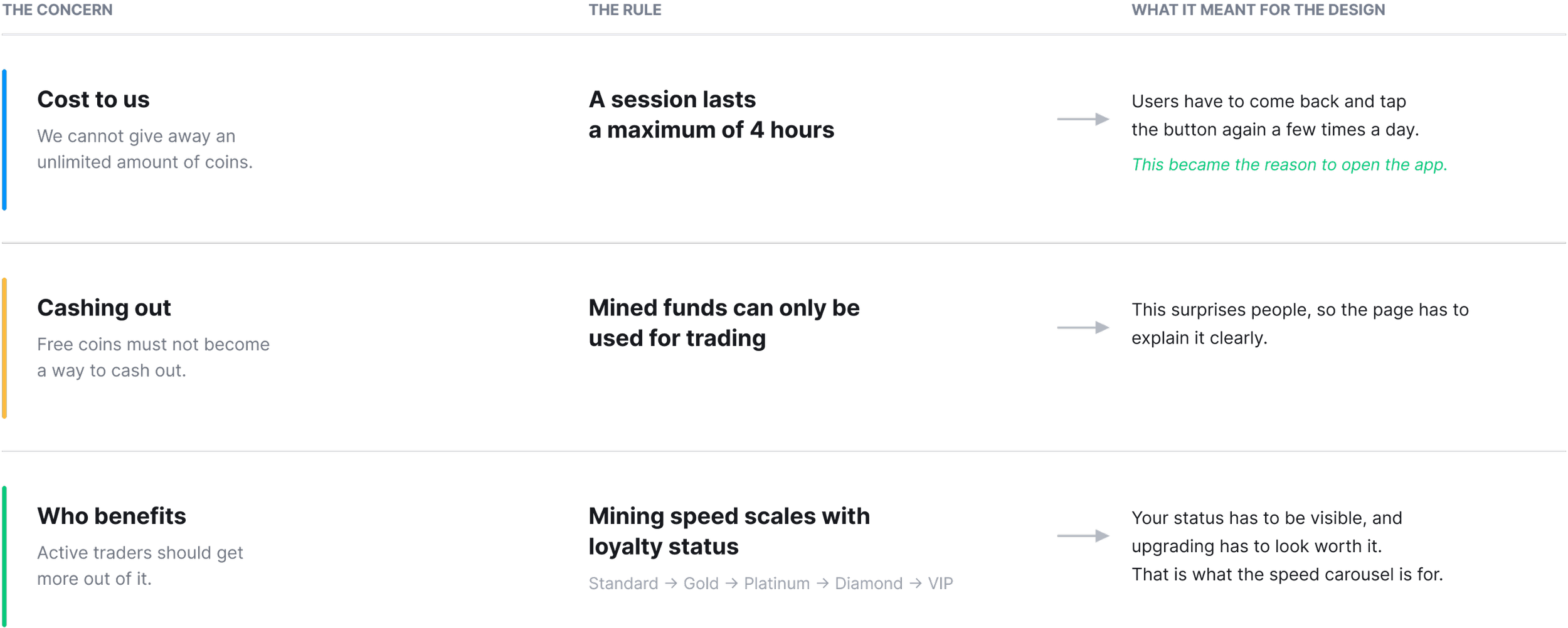
Working with the risk and product teams, we agreed on three rules the miner had to follow to be safe for the business. Each one changed something the user would see, so each one became part of the design.
MVP
The first version
Wireframes with the product manager and the CEO, then prototypes and usability testing. Something got cut every round. A withdrawal history list went first — nobody looked at it.
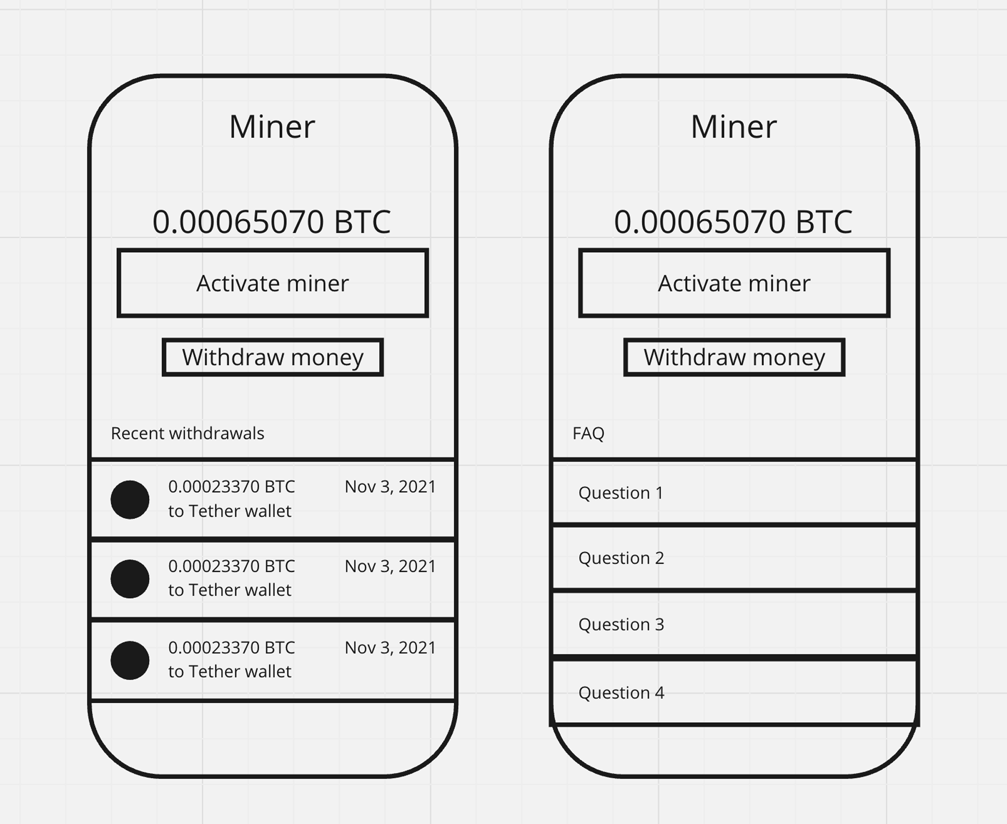
An early wireframes showed withdrawal history. It was replaced with an FAQ.
The MVP shipped with four things on the page.
Balance in BTC, with the USDT equivalent.
Withdraw, disabled below 10 USDT.
Activate, labeled with the four-hour session length.
FAQ, because the rules needed explaining.
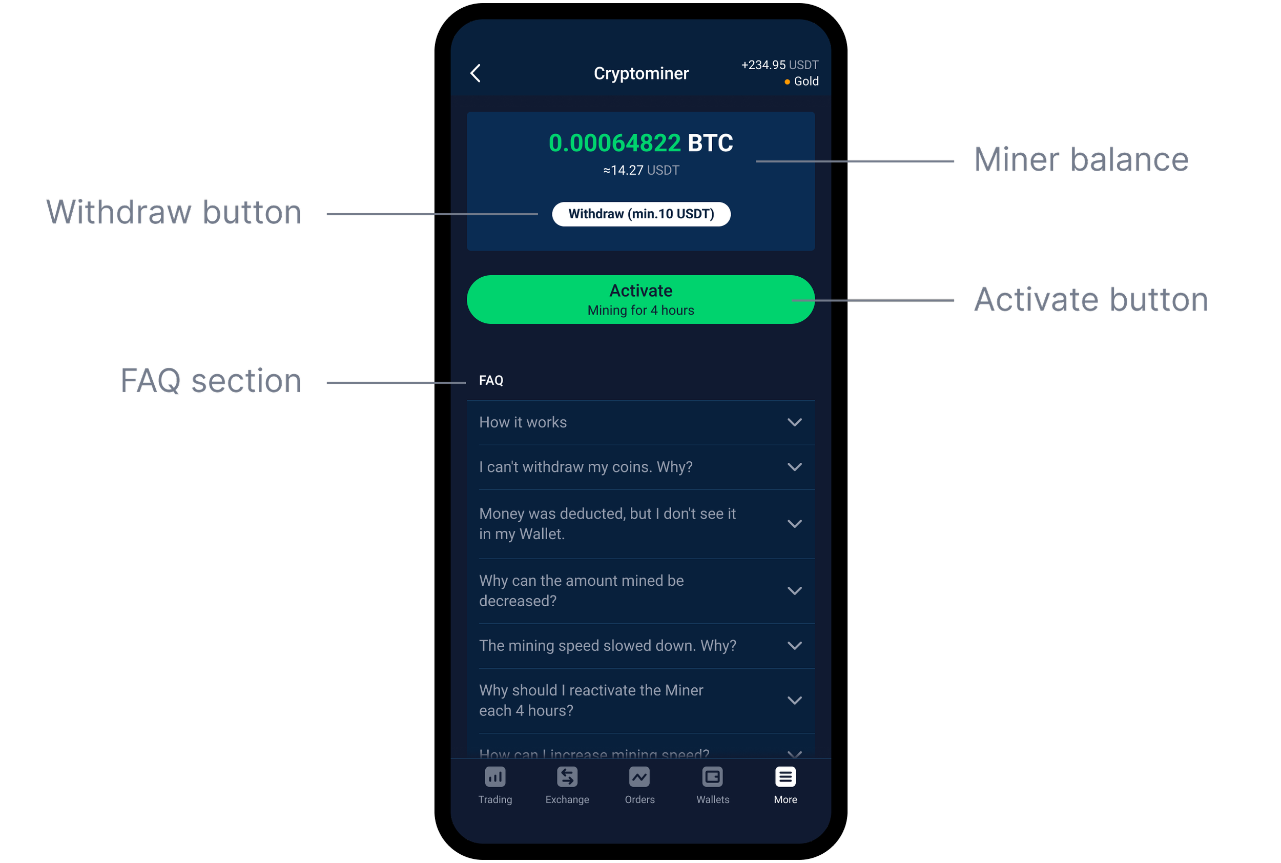
After launch
Heavy use from the start. Retention and trading volume both went up, and the miner became one of the most visited pages in the app.
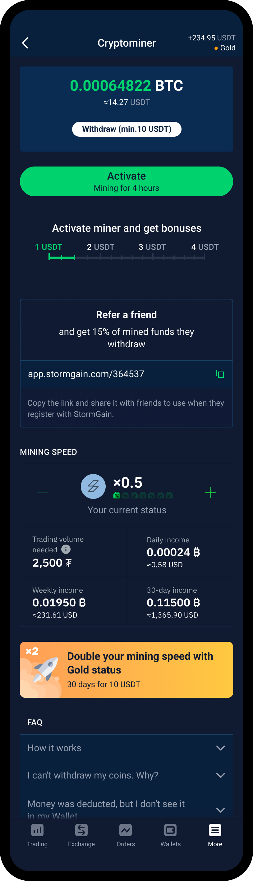
The miner became a growth surface. Over the next iterations, we added:
A bonus for activating more often.
A referral program, paying 15% of what invited friends withdrew.
Mining speed, with a projected income table.
A promo: Gold status for 10 USDT a month.
Each one made sense on its own, and each one was asked for by someone with a good reason.
WHERE IT BROKE
We kept adding things, and the click rate dropped
What the data showed
Click rate on the mining button was falling. Follow-up user research explained it: nothing told users where to look first, so the button competed with four offers for attention.
Making the case
It was important to keep in mind: the only thing we need a user to do on this page is press the button, and everything else is secondary.
However, every section has been making a value and has been connected to different dependencies and marketing campaigns. So, we couldn’t simply delete them.
REDESIGN
One button, everything else one swipe away
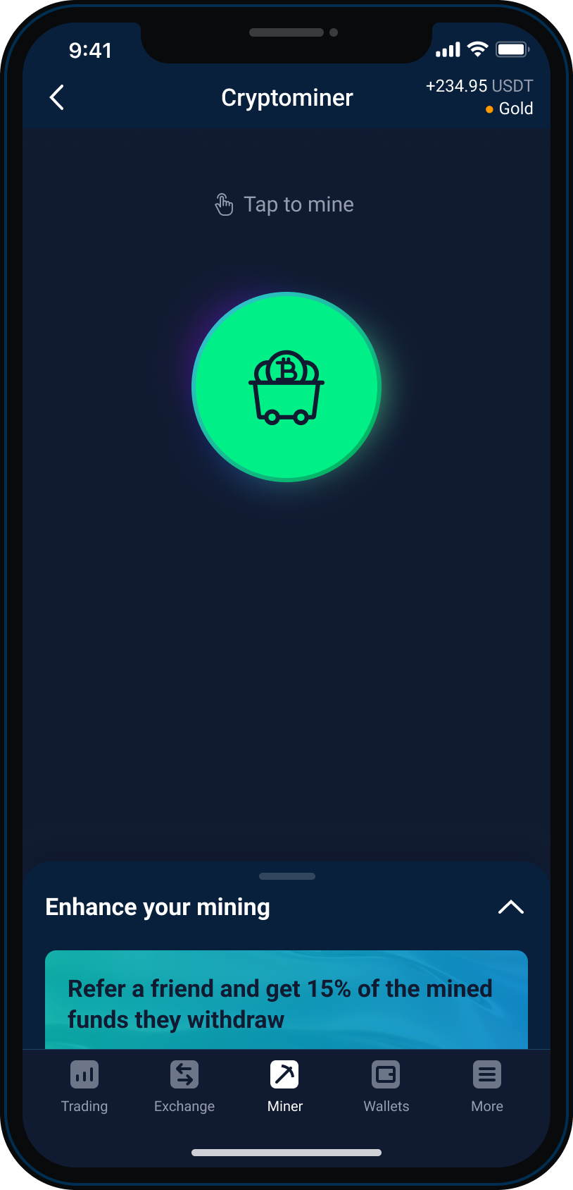
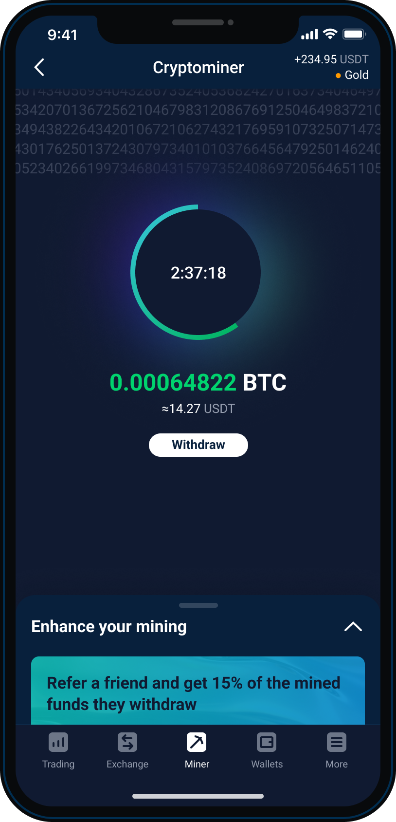
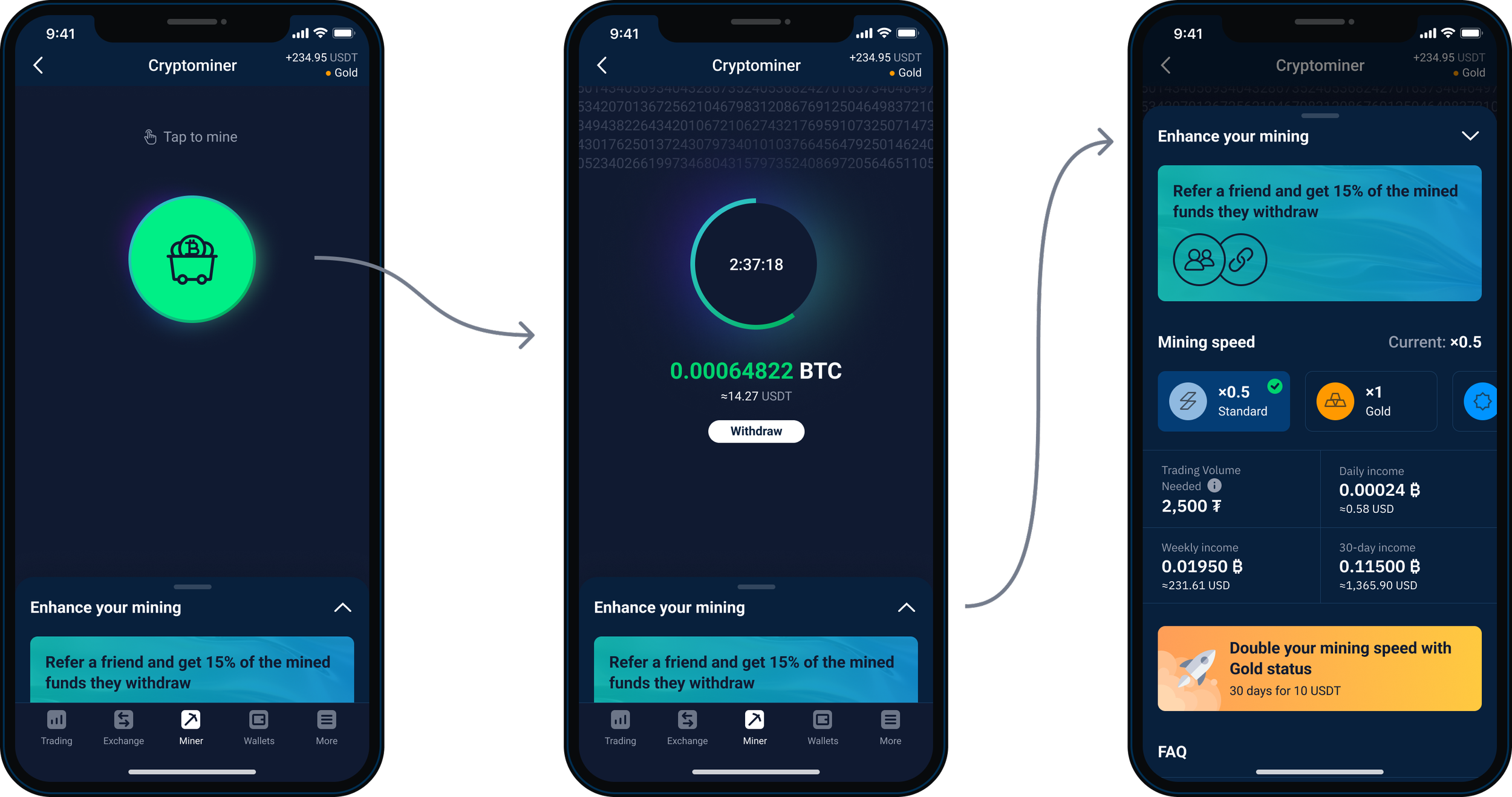
The rebuild came down to three moves: give the button the whole screen, put the session status inside it, and drop everything else into a bottom sheet. Same content, one screen.
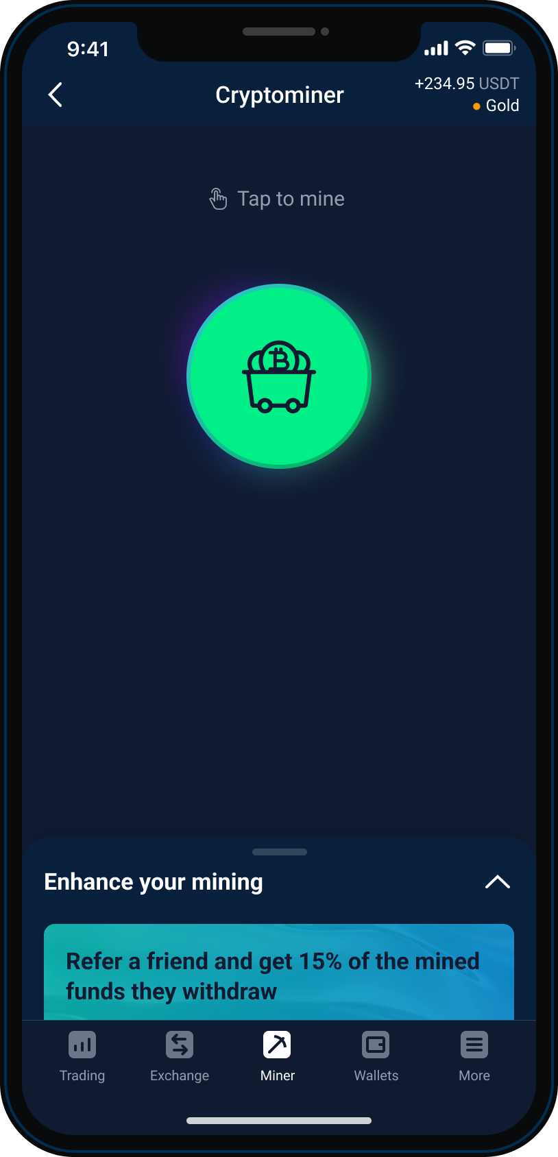
Secondary content behind a swipe rather than a scroll.
Make the button impossible to miss
A large circle on an otherwise empty screen, with a Bitcoin icon and an animated glow. Two words above it: Tap to mine.
Put the status inside the button
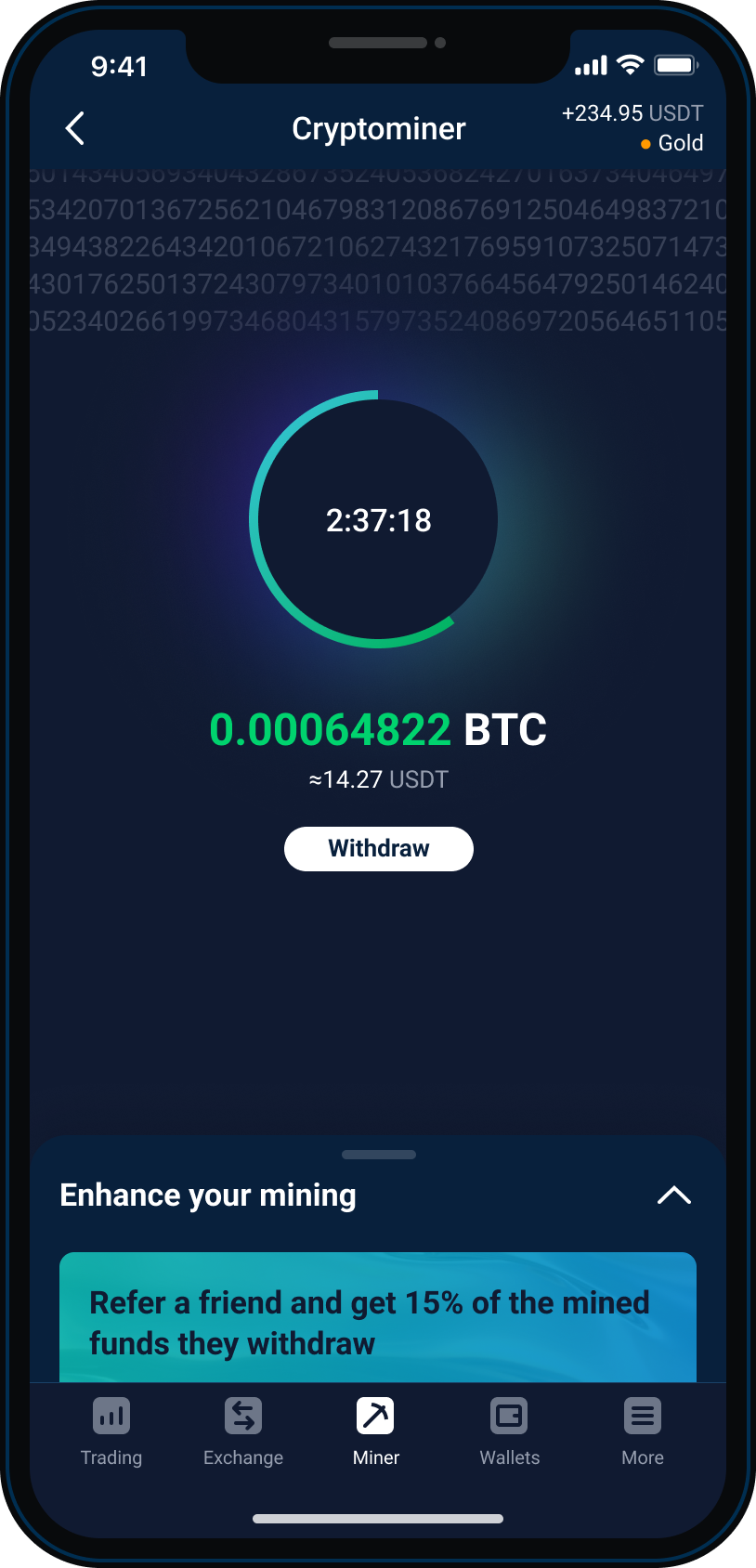
On tap, the circle becomes a countdown ring: time left in the session, mined balance, withdraw once eligible, and bonus progress underneath.
You start the miner and check on it in the same place.
Move the rest into a bottom sheet
Closed, the sheet is one line and a referral teaser. Open, it holds the referral card, the mining speed carousel, the income table, the promo, and the FAQ. None of it was removed. It stopped competing with the button.
VALIDATION
A/B test instead of assumptions
Variant A was the simplified page; Control is the existing one. The hypothesis: focusing the page on one action lifts the click rate without hurting what moved into the sheet.
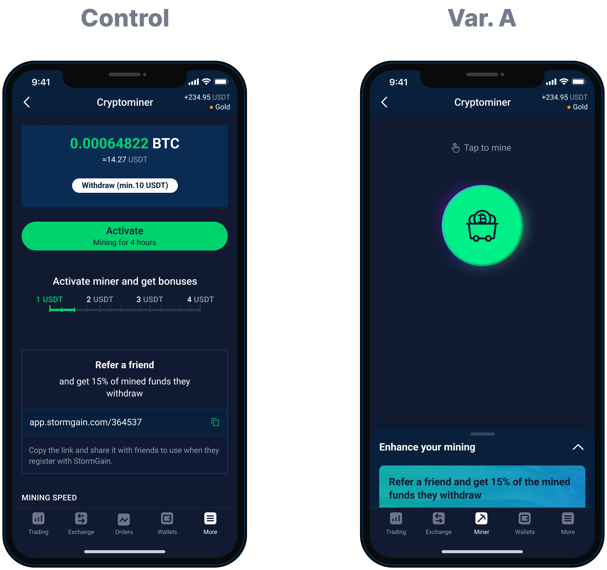
After a few weeks, Variant A led on all three:
+8.12% mining button click rate
+6.29% monthly retention
Higher trading volume, the company’s main KPI
Referrals and status upgrades kept working from inside the sheet.
Reflections and takeaways
Features that work alone can still break each other. The damage only showed up in the trend, not in any single usability session.
Removing is design work. This redesign added almost no functionality. The value came from ranking.
After the test, the team kept iterating on the contents and order of the bottom sheet.