
BetterSleep – Sleep Phases Redesign
User-centered design and AI usage are turning confusing charts into actionable sleep insights.
ROLE
Product Designer
TIMELINE
~2 months
COLLABORATION
PM, developers, designers
PRODUCT CONTEXT
Sleep tracking in BetterSleep
BetterSleep is a sleep and wellness app that helps people fall asleep and build better sleep habits.
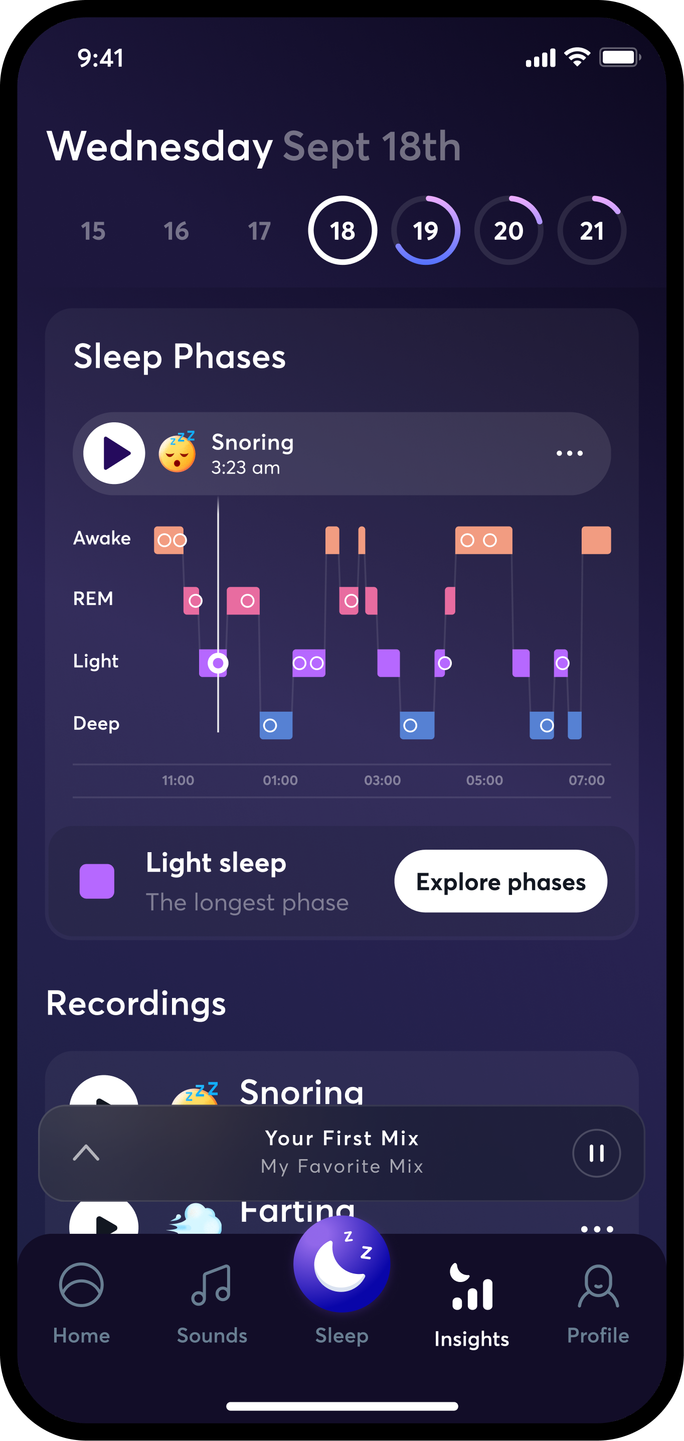
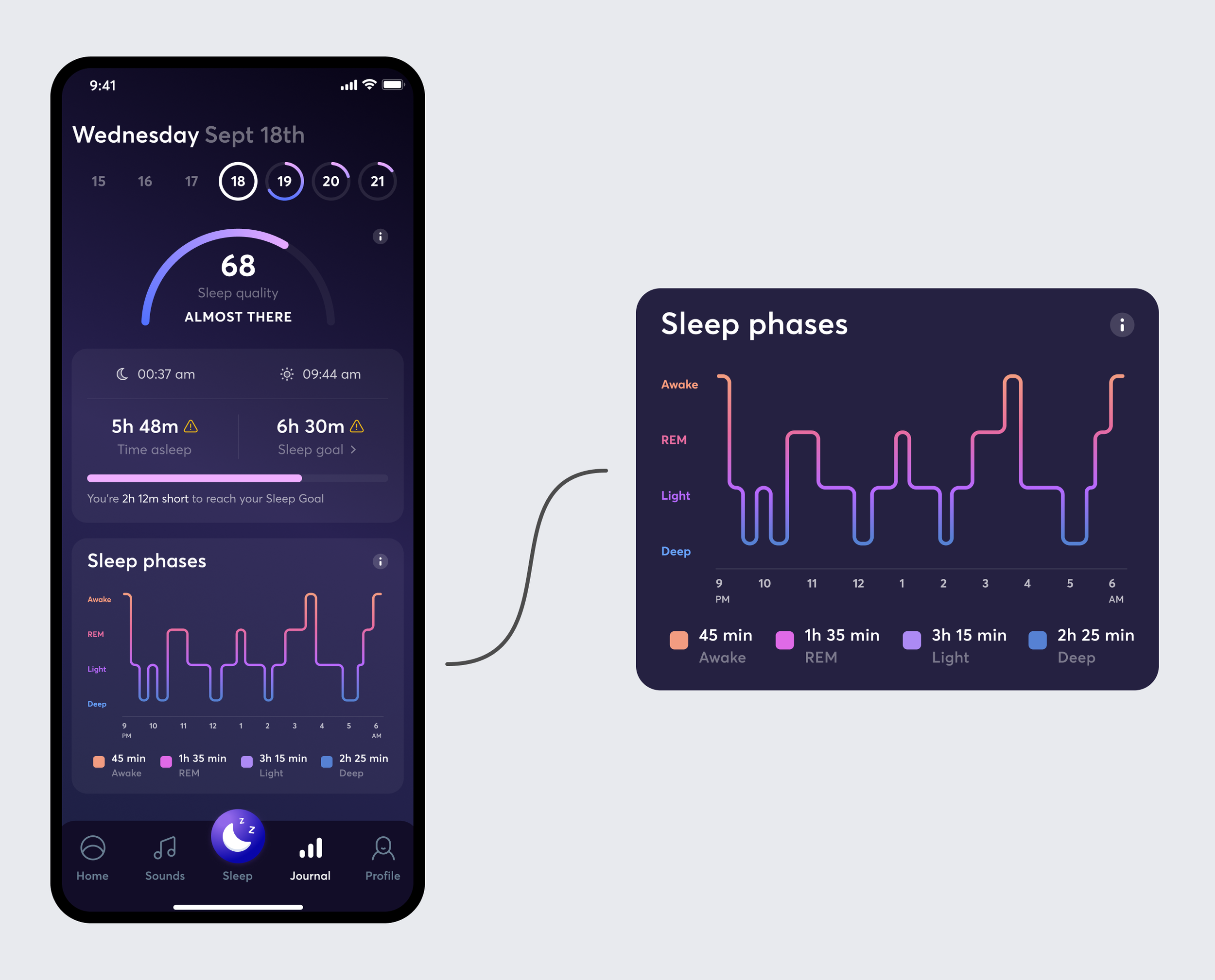
The app can track a user’s sleep and show the results the next morning, including sleep time, recordings, a sleep score, and sleep phases. Sleep Insights helps users understand this data and find useful content in the BetterSleep library.
Unclear sleep phases
Users could not explain what REM, Light, or Deep sleep meant.
No next step
When users saw a difficult night, they did not know what to do with the information.
The Problem
The Sleep Phases graph sat between the sleep summary and recordings. Sleep Phases should have helped users understand why their night was good or bad. Instead, many users skipped this section and went straight to their recordings.
Research findings
Confusing graph
The line size and shape did not match the actual duration of each phase.
Hard to read
Small labels and legends made the screen difficult to scan and read.
RESEARCH
What users needed
I used usability testing, heat maps, and competitor reviews to understand why users were not using Sleep Phases.
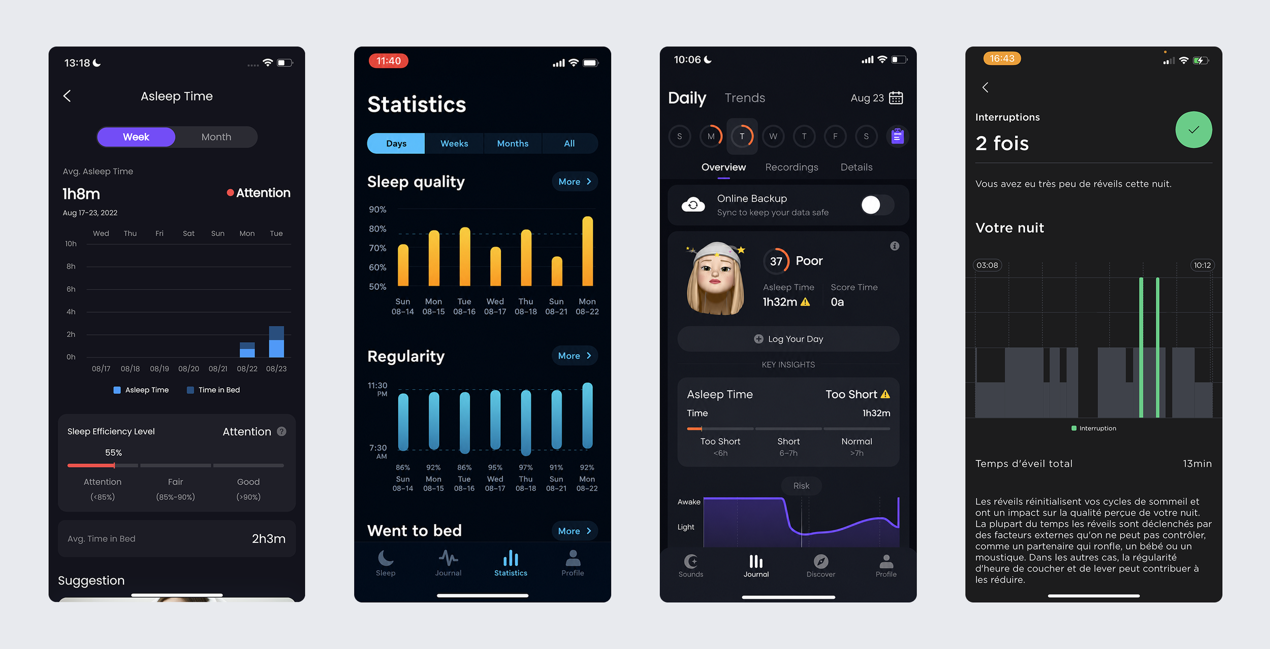
Competitor review: examples of how other products explain sleep patterns and interruptions.
Key gaps
No clear main insight: users had to work out the whole graph by themselves.
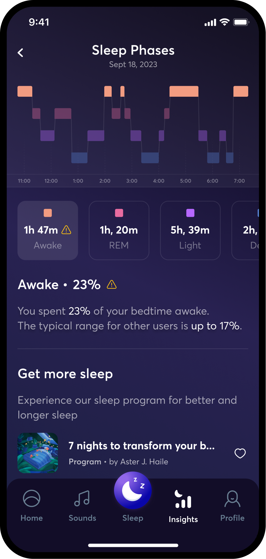
No explanation of what was normal or why a phase mattered.
No direct connection between an identified issue and helpful BetterSleep content.
Design direction
Hierarhy
Show one important sleep issue first instead of giving every data point the same focus.
Hierarchy
Show a simple summary first, then an explanation, then a clear next step.
Design direction
Show one important sleep issue first instead of giving every data point the same focus.
Make the size of each graph section match its duration.
Show a simple summary first, then an explanation, then a clear next step.
Make labels and text easy to read from the start.
The graph's clarity
Make the size of each graph section match its duration.
Accessibility
Make labels and text accessible and easy to read.