
BetterSleep – Sleep Phases Redesign
User-centered design and AI usage are turning confusing charts into actionable sleep insights.
ROLE
Sr. Product Designer
TIMELINE
~2 months
COLLABORATION
PM, developers, designers
PRODUCT CONTEXT
Sleep tracking in BetterSleep
BetterSleep is a leading Canadian sleep and wellness app that helps people fall asleep and build better sleep habits.
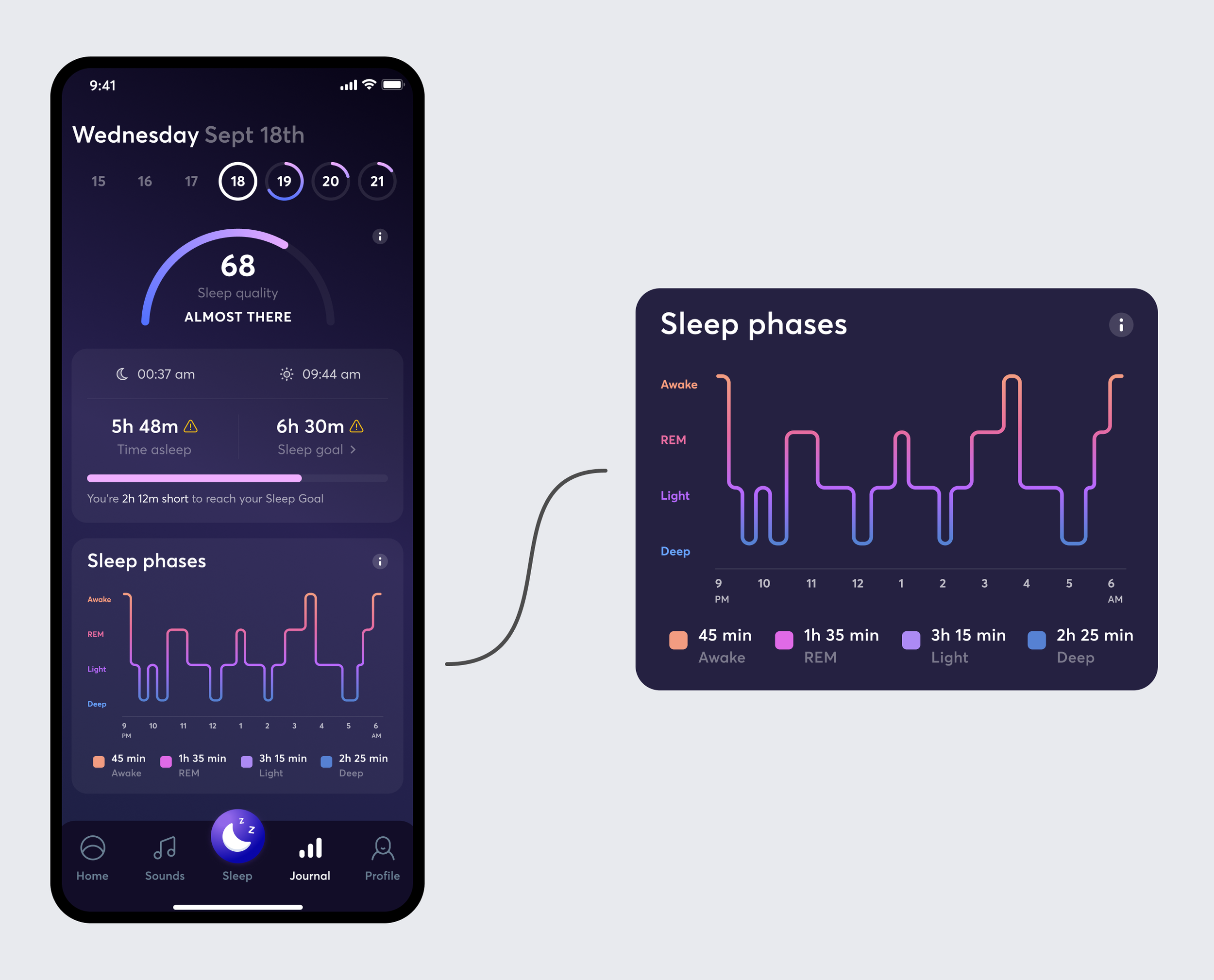
The app can track a user’s sleep and show the results the next morning, including sleep time, recordings, a sleep score, and sleep phases. Sleep Insights helps users understand this data and find useful content in the BetterSleep library.
The Problem
The Sleep Phases graph sat between the sleep summary and recordings. Sleep Phases should have helped users understand why their night was good or bad. Instead, many users skipped this section and went straight to their recordings.
Research findings
Unclear sleep phases
Users could not explain what REM, Light, or Deep sleep meant.
No next step
When users saw a difficult night, they did not know what to do with the information.
Hard to read
Small labels and legends made the screen difficult to scan and read.
Confusing graph
The line size and shape did not match the actual duration of each phase.
RESEARCH
What users needed
I used usability testing, heat maps, and competitor reviews to understand why users were not using Sleep Phases.
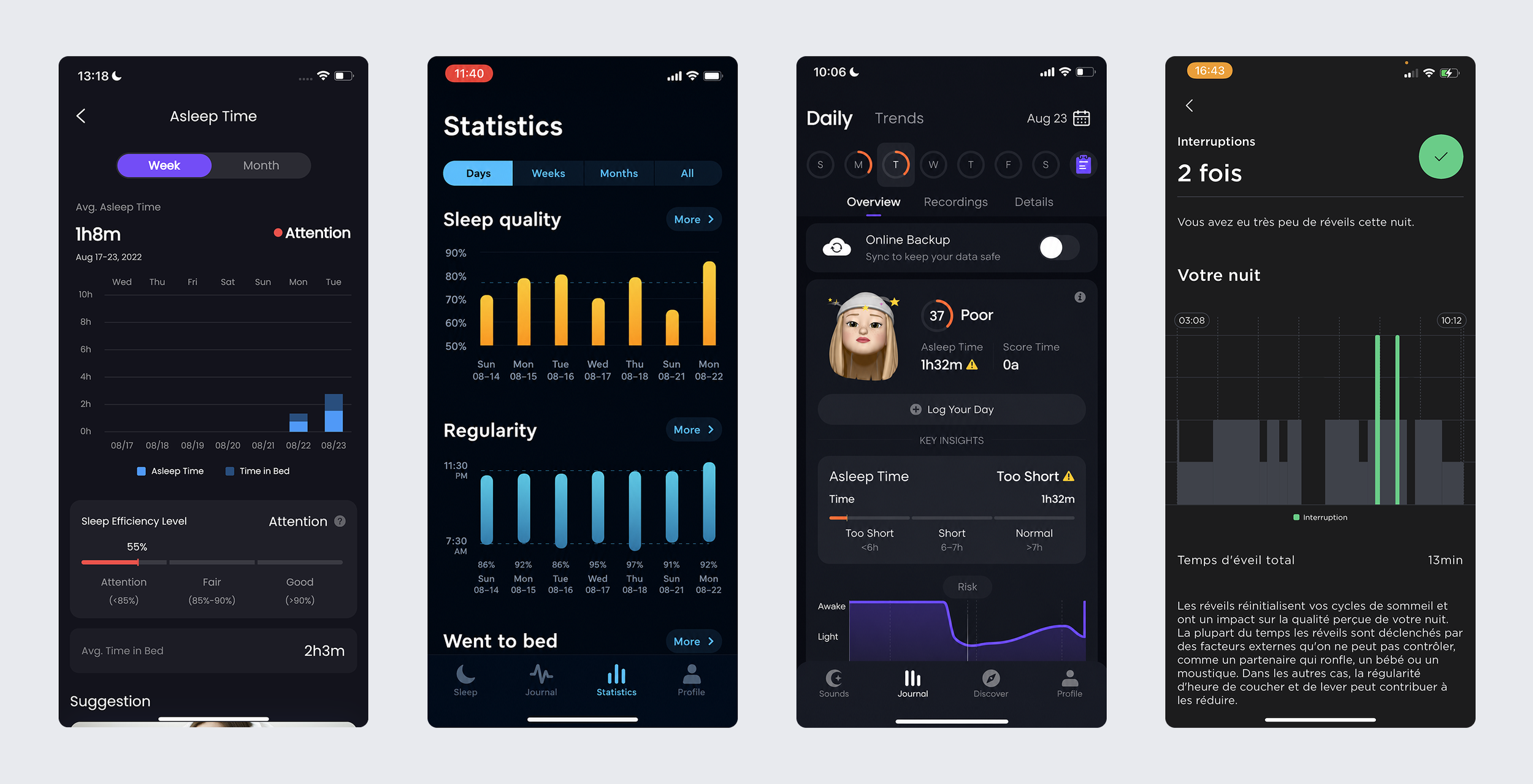
Competitor review: examples of how other products explain sleep patterns and interruptions.
Key gaps
No clear main insight: users had to work out the whole graph by themselves.
No explanation of what was normal or why a phase mattered.
No direct connection between an identified issue and helpful BetterSleep content.
Design direction
Focus on the main
Show one important sleep issue first instead of giving every data point the same focus.
Hierarchy
Show a simple summary first, then an explanation, then a clear next step.
The graph's clarity
Make the size of each graph section match its duration.
Accessibility
Make labels and text accessible and easy to read.
EARLY IDEAS
Turning research into a first concept
I started with quick paper sketches. This helped me share ideas with the product manager before creating detailed screens.
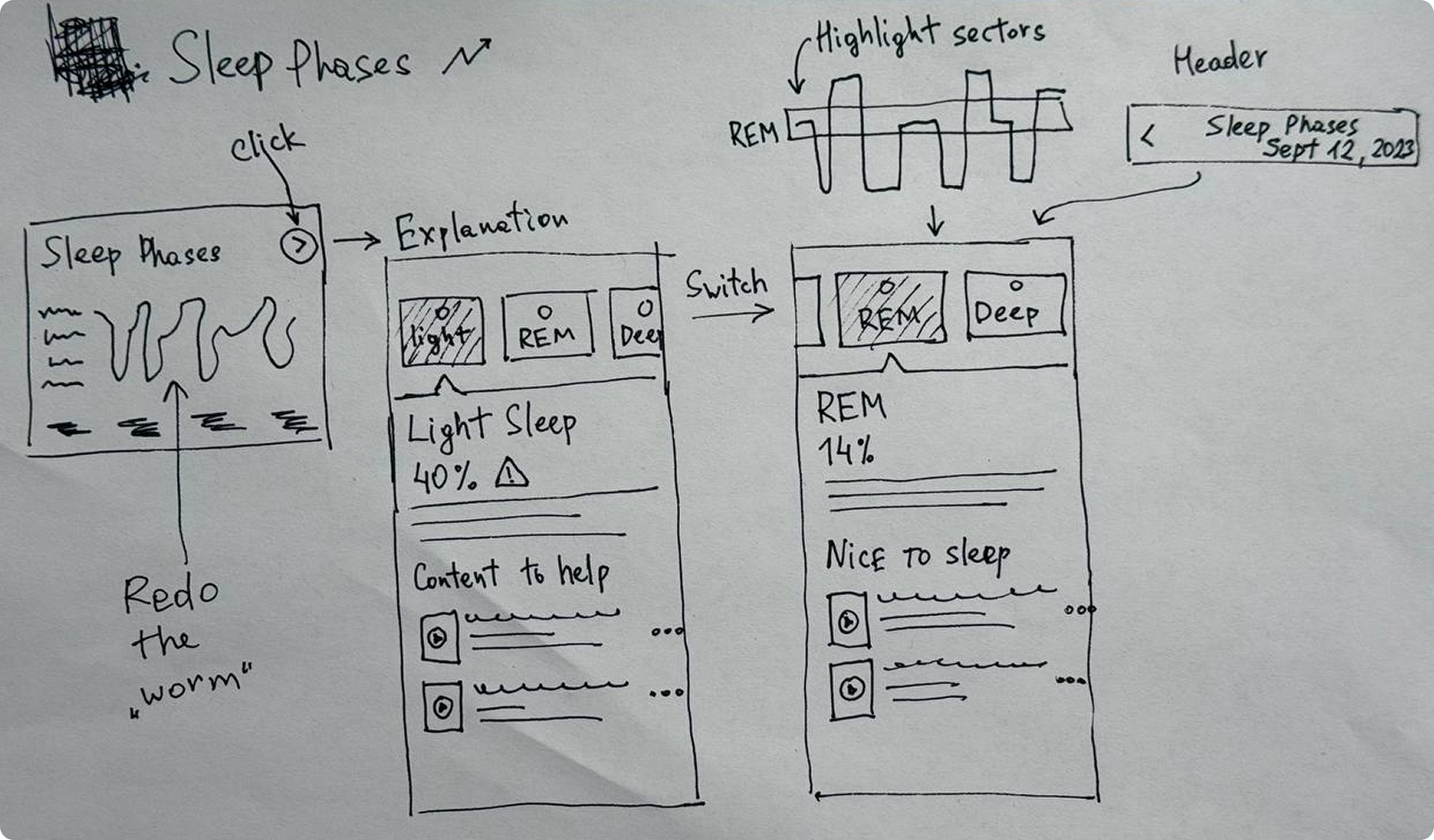
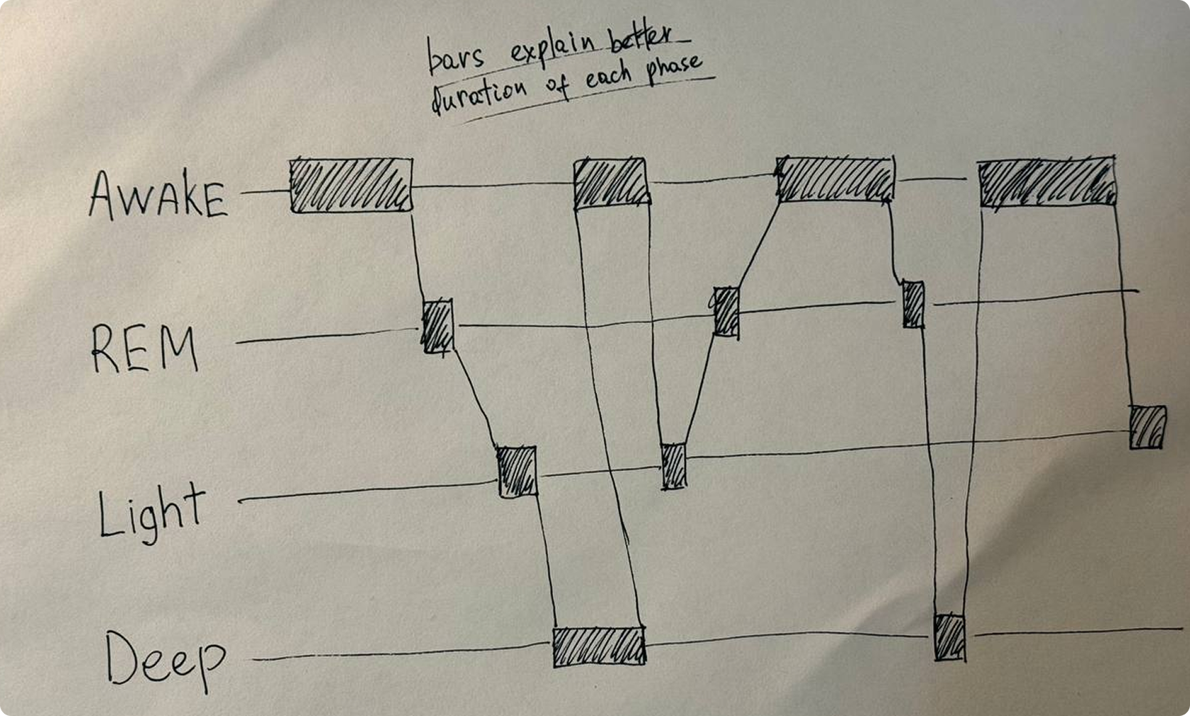
Early paper concepts explore phase explanation, navigation, recommendations, and a duration-based graph.
Ideas tested
01.
A clear entry point from the Tracker summary into a dedicated Sleep Phases experience.
02.
Separate explanations for Awake, REM, Light, and Deep sleep, with a phase switcher.
03.
Recommendations tied to the issue identified in the user’s night.
04.
A bar graph where the size of each phase matched its real duration.
FIRST VERSION
AI explanations and content suggestions
I kept the old graph for the first version and focused on adding more value to the Sleep Phases experience. Using the OpenAI API, we generated personalized explanations of each sleep phase, what its duration could mean for the user, and which content from the BetterSleep library could help improve their sleep.
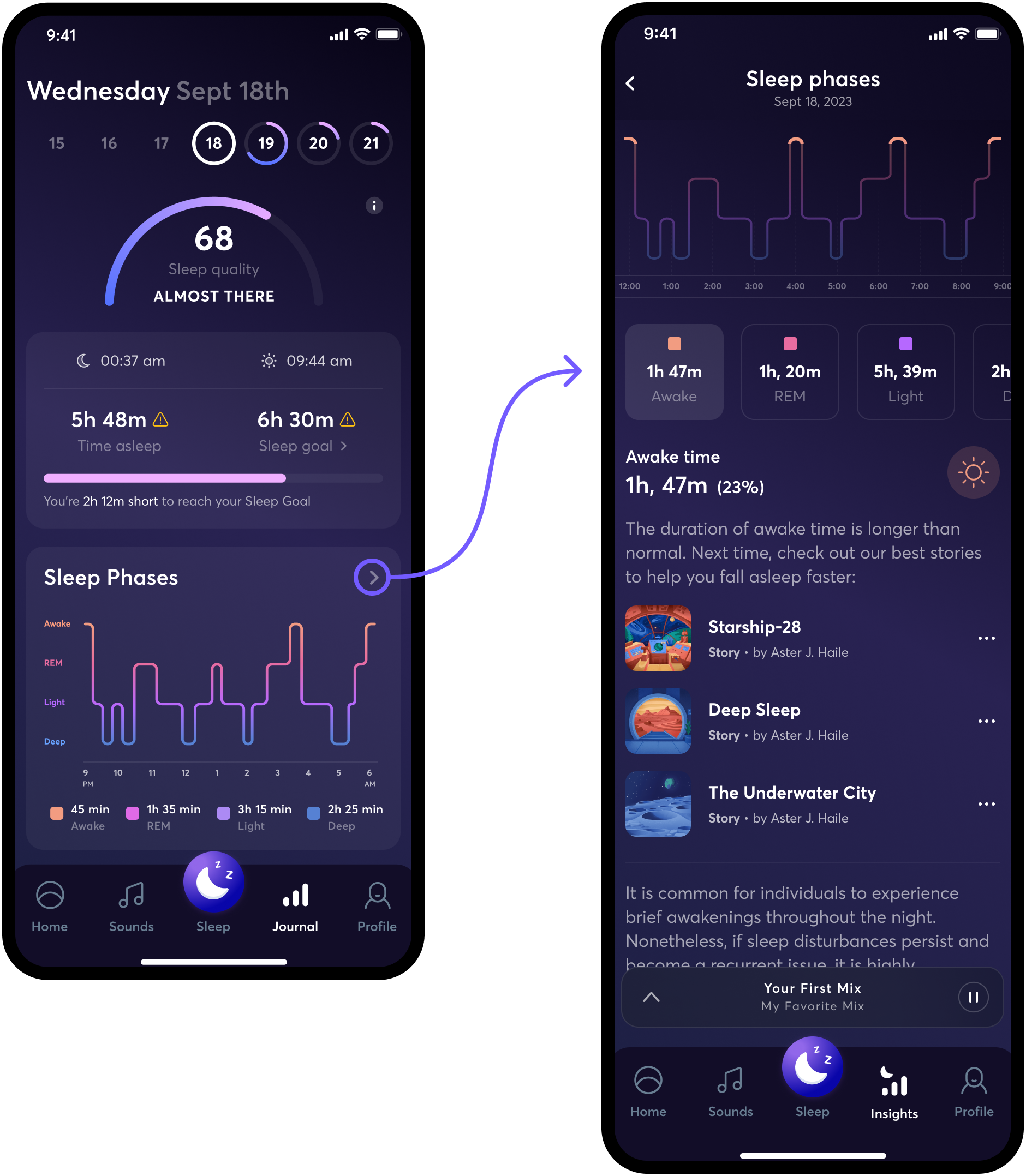
First version: the graph connected to a new Sleep Phases page with explanations and content.
What I designed
01.
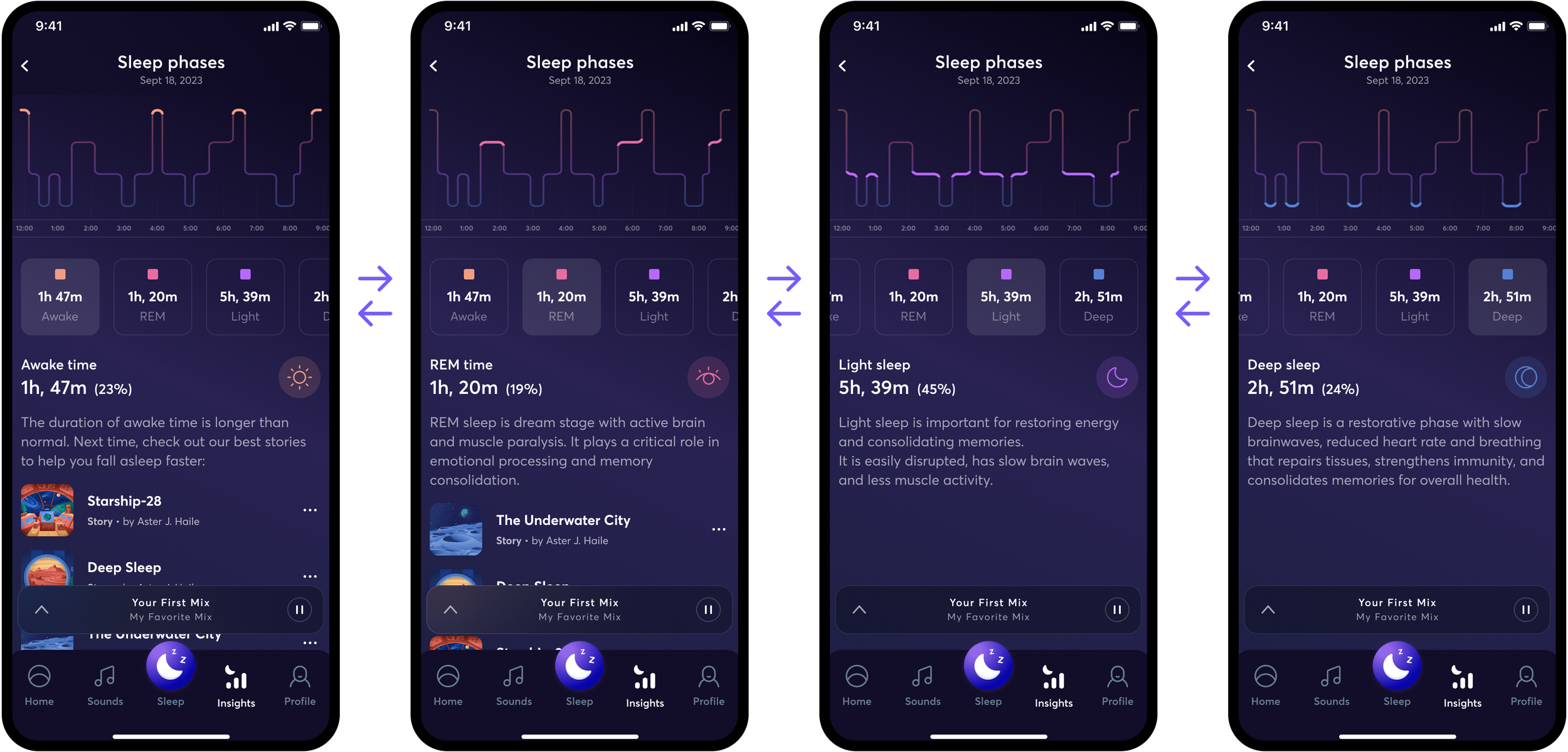
On the new Sleep Phases page, users could switch between phases and see what each phase meant.
03.
AI suggested stories, meditations, and sounds from the BetterSleep library that could help with the user’s sleep issue.
02.
AI created a short explanation based on the user’s sleep-phase results.
04.
The selected phase was highlighted on the graph to connect the explanation with the nightly timeline.
One-page pattern for every phase
Each page used the same simple structure: show the phase on the graph, explain the result with AI, then suggest BetterSleep content that could help.
What still needed work
The entry point was too small and easy to miss.
The old graph still did not show duration well, and its labels were too small.
ITERATION 2
Making the entry point visible and testing ‘normal’ ranges
In the next version, I made the entry point easier to see. I also designed a ‘typical range’ bar that graphically explains the normal range and what the user was comparing it to.
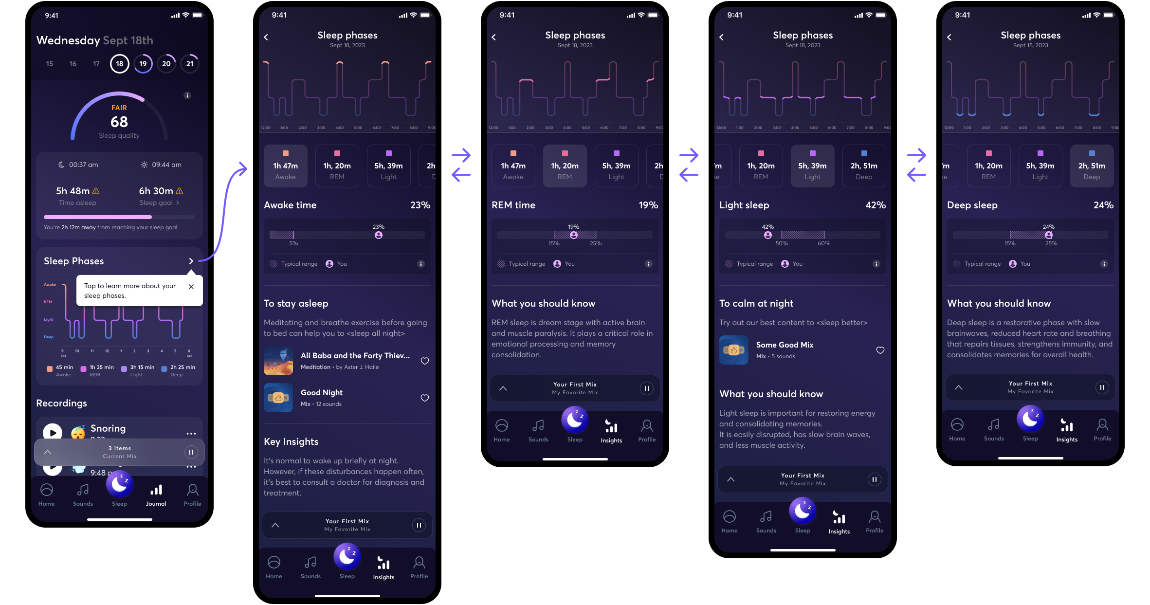
Iteration 2: tooltip, stronger content, and a ‘typical range’ comparison.
What we tested
A first-use tooltip directed attention to the Sleep Phases entry point.
A ‘typical range’ bar compared the user with a normal range.
Refined explanations, content suggestions, and key insights.
Why it changed again
The main sleep issue was still hard to see, the line graph did not show duration well, and the labels were still too small. Testing also showed that the typical-range bar confused users, so I removed it.
FINAL DESIGN
Clear sleep results and next steps
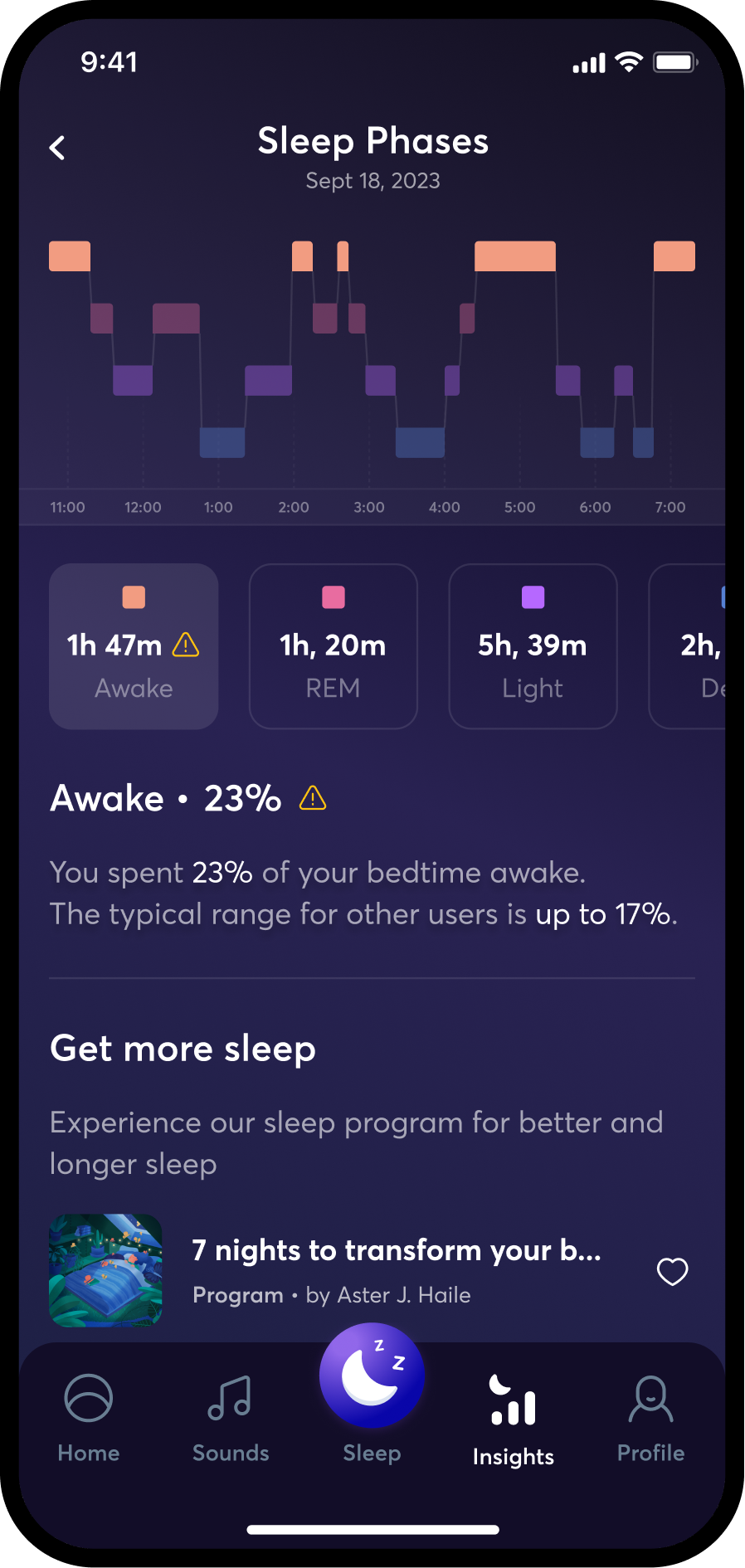
The final design made the main sleep issue easy to see and gave users a clear way to learn more.
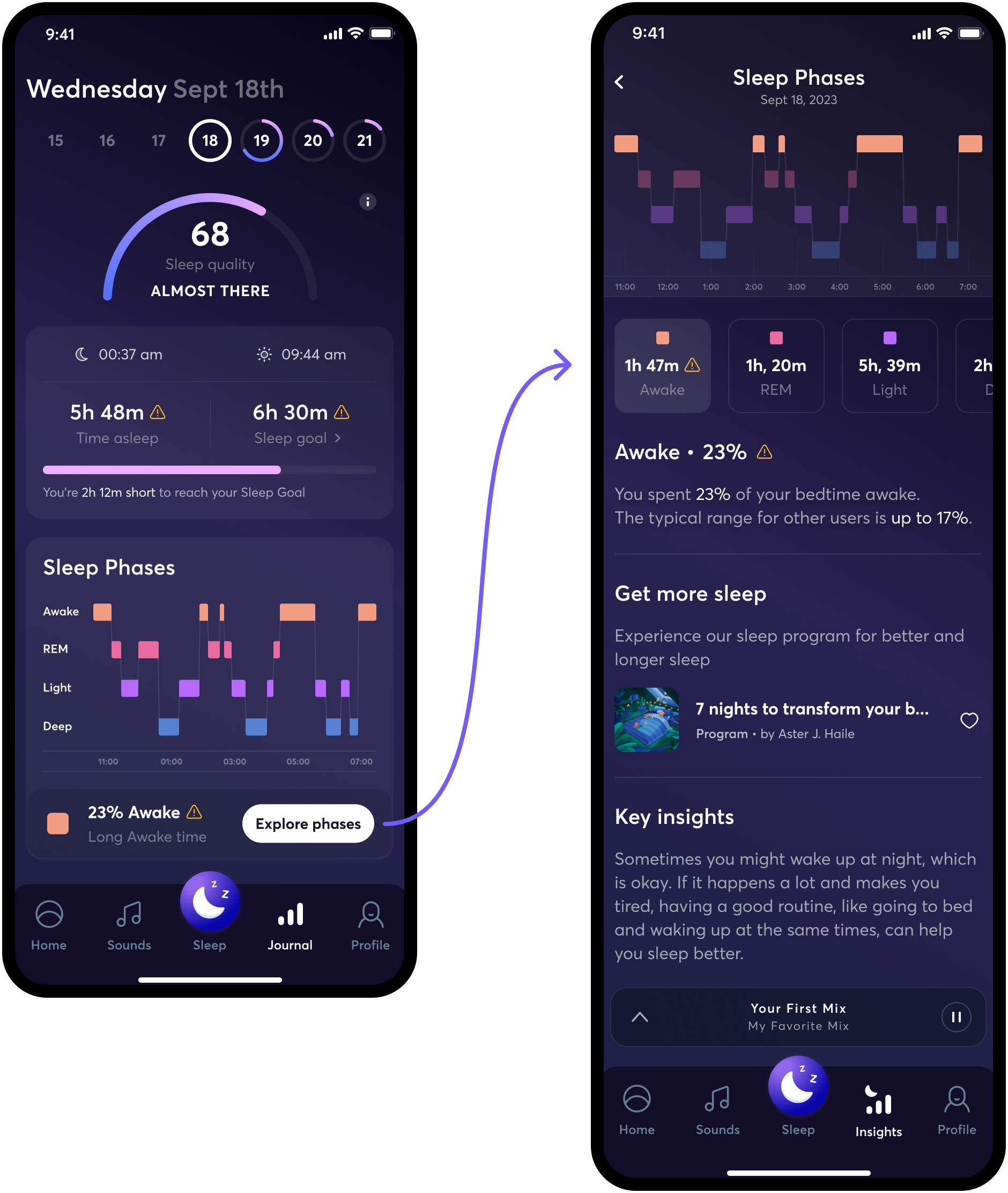
Final design: duration-based phase bars, a prominent insight card, and a detailed phase view with next steps.
Key design decisions
Highlight the main issue
Surface the most important problem of the night, such as extended awake time.
Make the path obvious
Use a prominent ‘Explore phases’ CTA instead of a small entry point.
Match visual weight to duration
Use bars to make the relative length of each phase visible.
Clarify problem states
Use warning icons and labels to distinguish notable issues from neutral data.
Remove confusing context
Remove the typical-range bar after testing showed it was difficult to interpret.
Connect insight to action
Lead from each phase to explanation, guidance, and relevant content.
EXTENSION, IMPACT & REFLECTION
Further steps and experiments
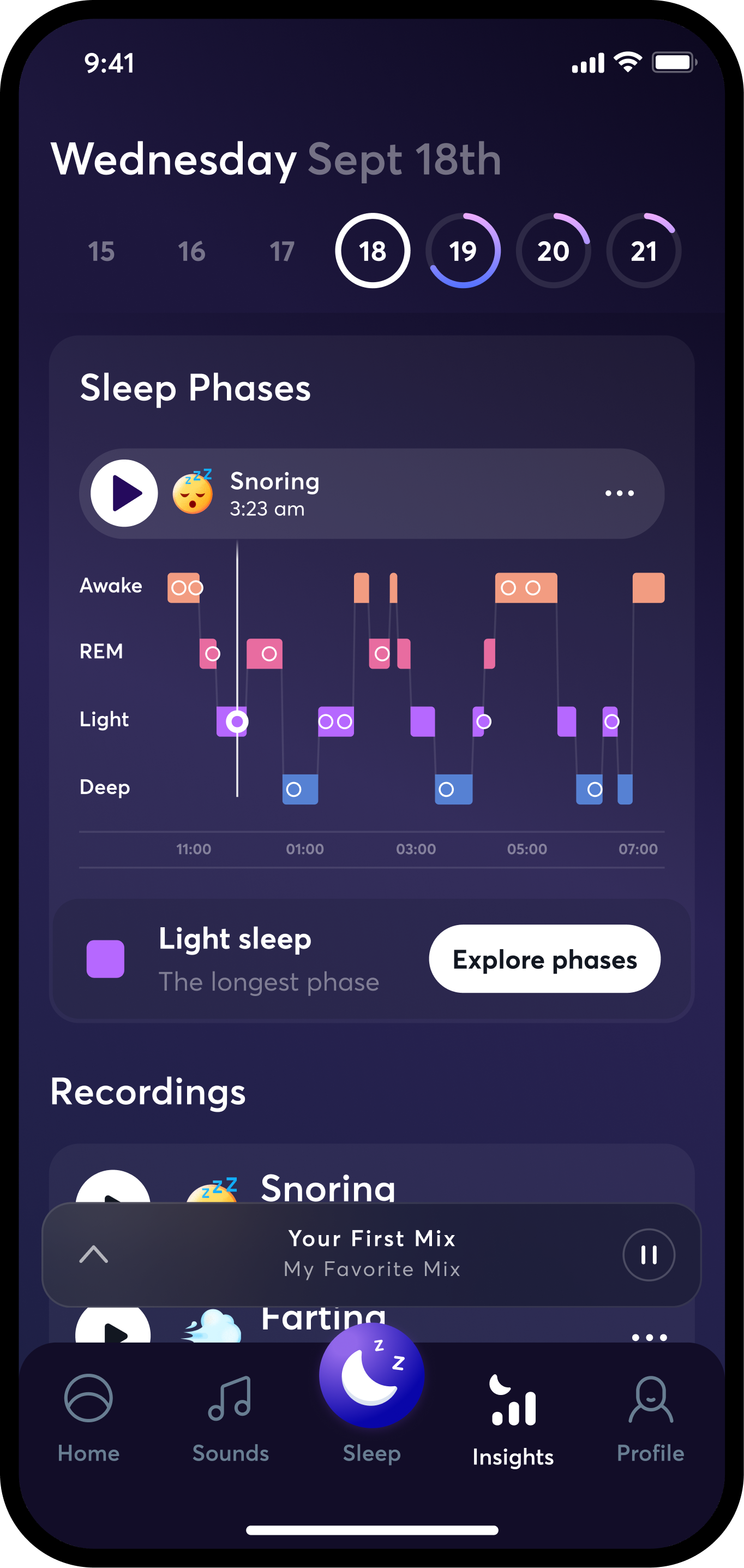
A cross-team discussion generated an additional idea: connect night recordings directly to the exact moment they occurred on the sleep graph.
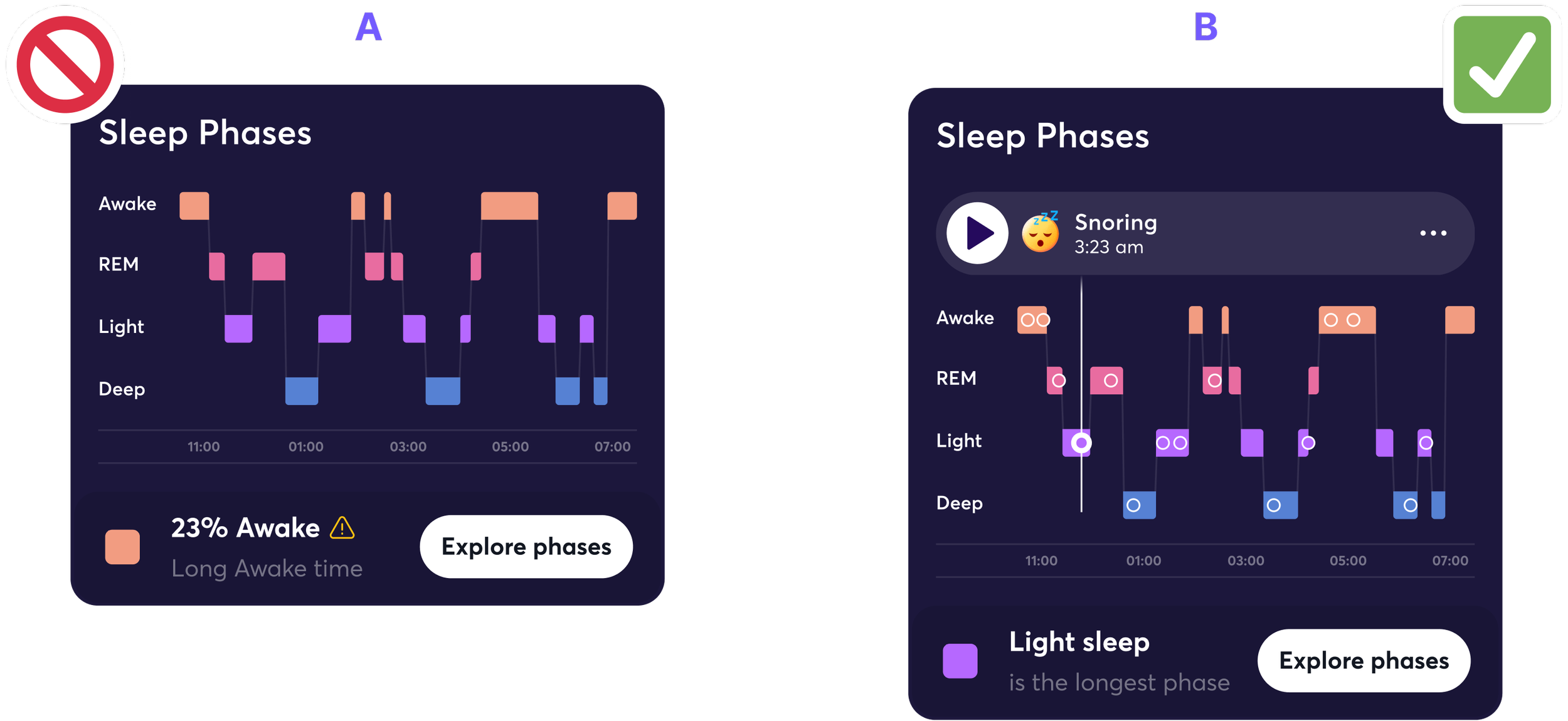
Recordings experiment: variant B placed playback at the moment a sound occurred during the night.
Key takeaways
Users do not need raw data alone; they need interpretation.
One main issue reduces cognitive load and creates a clearer hierarchy.
Recommendations turn retrospective data into a useful next step.
The ‘typical range’ looked useful in theory, but testing showed it should be removed.
What we learned from the experiment
Variant B generated stronger interaction with playback and night sound switching by connecting two behaviors users already valued: understanding the night and listening to its recorded sounds.
Outcome
Post-launch data revealed positive trends in key Tracker engagement and retention metrics, including sleep-tracking retention, sleep-tracking duration, and completion of extended tracking sessions. Specific figures and internal measurement details are not included to maintain confidentiality.